
Food Delivery Performance Analysis
📊 The world of KPIs! In this project, I asked our beloved ChatGPT (which I'll affectionately call Geppetto from now on) to roleplay as my manager and request a performance analysis of a food delivery app from me. I'm developing the habit of using AI to simulate real-world problems during my studies. Since I don't yet work in the field, I lack experience with certain business challenges. This approach represents a productive way to use AI: rather than just asking for answers, you request problems and attempt to solve them using your skills. Follow below the challenge that Geppetto presented me:🎯 Business Objective:
The manager wants to improve the efficiency of the deliveries because we are receiving many complaints about late orders.
📈 Target:
Reduce the average delivery time to a maximum of 35 minutes within 2 months.
What the manager wants to know often:
- The current average delivery time.
- What percentage of orders are arriving in the ideal time (≤ 35 minutes).
- Which regions of the city have the most delays.
- Whether performance is getting better or worse over time.
Dashboard
Analysis
What can we learn from the graphics?
- The overall average delivery time is 38.3 minutes, slightly above the target set (35 minutes). To address this, we are going to carry out an analysis by neighborhood so that we can act in the region where the “gap” is greatest.
- Looking at the ranking (table), we can see that all the neighborhoods have an average delivery time greater than the target of 35 minutes. If we sort by time, we see that the neighborhoods with the longest delivery times are Tatuapé, Bela Vista, Moema and Liberdade.
- The bar chart shows the neighborhoods with the most delays, which are Liberdade, Vila Mariana, Santana and Moema.
- The pie chart shows us that more than half of the deliveries were late (using the target of 35 minutes). You can change the target in the control field and the graphs will automatically adjust to the new target.
- The time series graph shows us the variation in delivery time over the month. I decided to use the control chart technique to separate noise from variations that really need attention. We can see that there are more days close to or exceeding the upper limit (6 days) than there are days below or close to the lower limit (4 days). This indicates that the delivery process is not performing well and, in order to achieve the 35-minute target, the process must be reviewed and fundamentally changed. For the other days, only a routine variation was observed.
- To build this control chart, I used the percentile technique, as the data does not follow a Gaussian distribution.
- The central limit is the average delivery time (orange line);
- The upper limit is the 95th percentile (red line);
- The lower limit is the 5th percentile (green line).
Suggestions for action
What to do now?
- In order to achieve the 35-minute target, it is recommended to prioritize the neighborhoods with the longest delays and highest delivery volumes, such as Liberdade (1st in the ranking) and Moema. As these neighborhoods significantly impact the overall average delivery time, optimizing their times will have a cascading effect, directly reducing their local averages while proportionally improving the global metric due to their weight in the total volume. Some suggestions for investigations are: checking for inefficient routes in these neighborhoods, traffic congestion, lack of local resources, among others.
- The time series graph shows us the variation in the delivery time throughout the month. The “Deliverer ID” filter can help identify which deliverers are experiencing the highest rate of delays, and consequently increasing delivery time variation. Deliverers with high variability or consistently above-average times should be the focus of training or route reviews, for example.
- Finally, an analysis of orders delivered by deliverers with high variability can be useful in determining whether a delay is really related to the deliverer or the type of order. Some orders may naturally take longer (e.g. large combos, more distant stores, among others) and this stratified analysis will be more accurate, as it helps to identify the real root cause of the delay and reduces false positives in identifying deliverers who need optimization.
Conclusion
Thank you for checking out this project to the end! What motivated me most to build this project were the concepts I recently learned from the book “Understanding Variation: The Key to Managing Chaos”, by Donald J. Wheeler.
This book goes into great detail about how to interpret data and how to separate noise from signals that really impact the business.
A quote from this book that I'm going to take with me from now on:
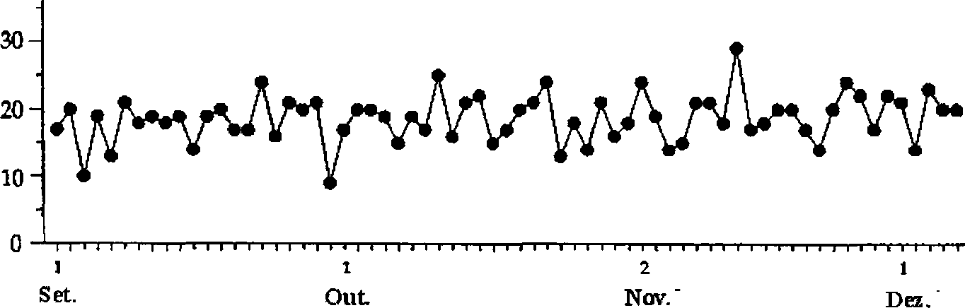
"Many years ago, David Chambers found the following sequence chart on the wall of the office of the president of a shoe factory. It was a simple and powerful presentation of data in context. The legend on the vertical axis was: ‘Daily Percentage of Pairs with Defects’:
Intrigued, David asked the chairman why he had the graph on the wall. The chairman condescendingly replied that he had done this so that he could tell how the factory was performing.
David immediately replied: 'Tell me what the situation is.'
Evidently, no one had the temerity to ask the president that, because he stopped, looked at the graph on the wall and then said: ‘Well, some days are better than others!’"
Right after that, the book details how to build a control chart to understand the difference between routine variations and exceptional variations in the process. It was just this type of chart that I implemented in this dashboard to understand the variation in delivery time more precisely. This is one of the fundamental principles for understanding that data will vary, even if the process remains the same, and knowing how to interpret these variations correctly and on a statistical basis is crucial for making decisions that really benefit the business.
I haven't finished reading the book I mentioned, but after finishing the first few chapters, I was eager to put my learning into practice on a project, and this was the result 💜
Finally, please find below a recommendation of the song that accompanied me during this study!